
Why Responsive design and the need to upgrade your site?
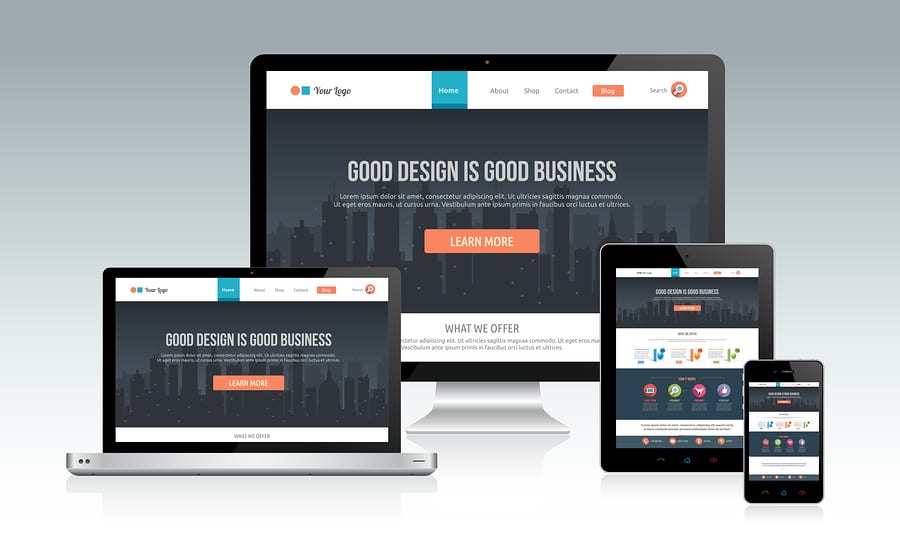
Your customers may be getting frustrated with your website if your site is not responsive. The way customers are viewing your website is evolving every day. The only way to see a website few years back was through a desktop or a laptop with a large screen. Websites had to be designed for only large screen sizes. This has drastically changed in the last year or so. Customers have devices of various sizes – mobile phone, tablet or laptop — and will visit your website on all these devices. It becomes practically impossible to have different versions of the website for all these different sizes (remember mobile apps?). To solve this we need to build responsive websites which should be able to respond to various sizes automatically. This can be done by using a mix of flexible layouts, images and using CSS media queries so the same theme we build can respond to different sizes of devices. Contact JenGraph Designs for more information on getting your new or current site responsive design today!